Design Considerations
Before developing a brochure consider the following design principles:
The Rule of Thirds
When laying out your brochure use the rule of thirds. Divide the page into thirds both vertically and horizontally. Areas where the lines cross are excellent points on your page for important visual elements such as a headline or image. Use the other lines to line up body copy, graphics or other page elements as needed. Note that a tri-fold design automatically incorporates the rule of thirds, but it is still possible to crowd the space by putting too much content along the fold so use the horizontal lines to aide with important graphical elements.
Type
- The typeface or font used in a brochure can make a big difference to the results you achieve. Limit brochures to two types of font. A san serif font such as Arial for headlines and a serif font like Times New Roman works best for text located in the body copy. Sans serif fonts are clean and look modern but can be hard to read. Serif fonts have tiny serifs or lines on the edges of the letter which reduces eye strain among readers and makes words easier to read.
- Use no more than three different font sizes. The size of the font is measured in points which simply refer to the font’s height. A good rule of thumb is for the heading text to be twice as large as the copy text and the subheading text should be halfway between. For example, in a brochure, set the headlines font size to 24 points, subheadings at 18 points and copy text at 12 points. Remember, it is best not to use a font size smaller than 10 points.
- Upper and lower case typeface has been shown to make headlines more readable.
- Do not mix too many type styles such as words in all capital letters, italics, bold-face or underlined. Overuse of these styles will deemphasize the message.
White Space
White space is the area on a page without words or that is left blank. This term applies even if the background has color. Crowding a brochure with too many visual elements or information will make it look cluttered and difficult to read, therefore reducing its overall effectiveness.
Brochure Layout
While a basic tri-fold design with six panels is the most common layout used, brochures come in many shapes and sizes. Other typical layouts include the bi-fold layout with four panels, z-fold layout with eight panels, or rack cards with only a front and back panel. Examples used throughout the remainder of this publication will focus on a standard tri-fold design; however the information can be adapted and applied for use with other layout designs as well.
Example Tri-Fold Brochure
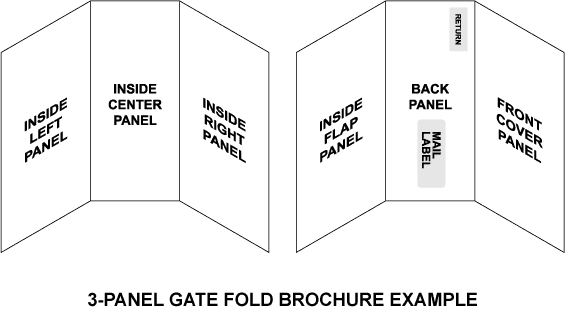
1. Outside Front Cover
- Attention getting headline should be placed on the top one-third of the page
- Business name, logo and other key information should be placed lower on the page
- Visual elements such as photographs or illustrations are encouraged but should not overshadow your message
2. Inside Front Cover
- Include a brief synopsis of information about business, product or service
3. Inside Middle Panel
4. Inside Back Flap
- Expand on customer benefits, products and services you summarized on inside front cover
- Include detailed information
- Use brief statements and bulleted lists
- Include visual elements
5. Outside Back Flap
- Generally the second panel viewed by the reader
- Favorable location for a promotional coupon or event registration
6. Outside Middle Panel
- Business logo
- Website address
- Return postal address if using as a direct mailer (refer to the latest postal guideline for accurate positioning)
Summary
Brochures can be an effective marketing tool when time is taken to carefully develop a proper strategy. Special attention should be given to the layout and other design considerations. When done correctly a brochure front cover will grab a reader’s attention by appealing to their needs. Focusing on the benefits will persuade them to open the brochure for further investigation. Communicating your company’s unique advantage will motivate readers to take action, thus resulting in your communication objective being met.
In Matcha Design, we have years of experience in designing award-winning brochures that work. Let us give you a boost in design and marketing!