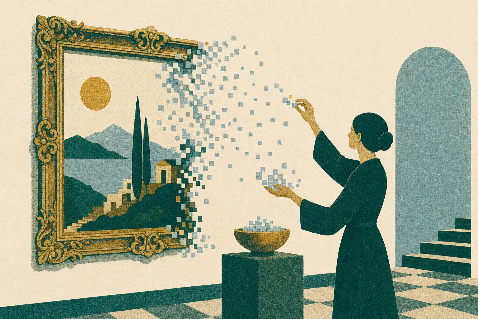
A professional work of cinema is the result of countless hours of creative work from many professionals, far beyond just the actors and directors. One such role is that of a film colorist. After filming wraps up, the colorist adjusts the look of each frame to evoke a specific emotion. They might add warm tones to spark joy or push cooler shadows to build suspense. Their job is to evoke the audience’s emotions through the use of color.
In the world of UX, designers often wear this same hat. Crafting a seamless flow and clean layout is only part of the job. Designers also shape the emotional atmosphere of a product. Just like colorists, they use subtle shifts in hue, saturation, and contrast to influence how users feel and how they respond to each message.
The Basics of Color Psychology
As we explored in our article on how color affects our mood and purchase decision-making, color choices influence both emotional tone and behavioral outcomes. We’re hardwired to associate warm tones with energy and action. Think of red stop signs, sale banners, or the thrill of an orange sunset. Cool tones, like ocean blues or forest greens, tend to calm us, signaling stability or reflection. But emotion is shaped by more than just hue:
- Saturation: shapes intensity. Bold, highly saturated colors create urgency, while muted tones evoke calm or nostalgia.
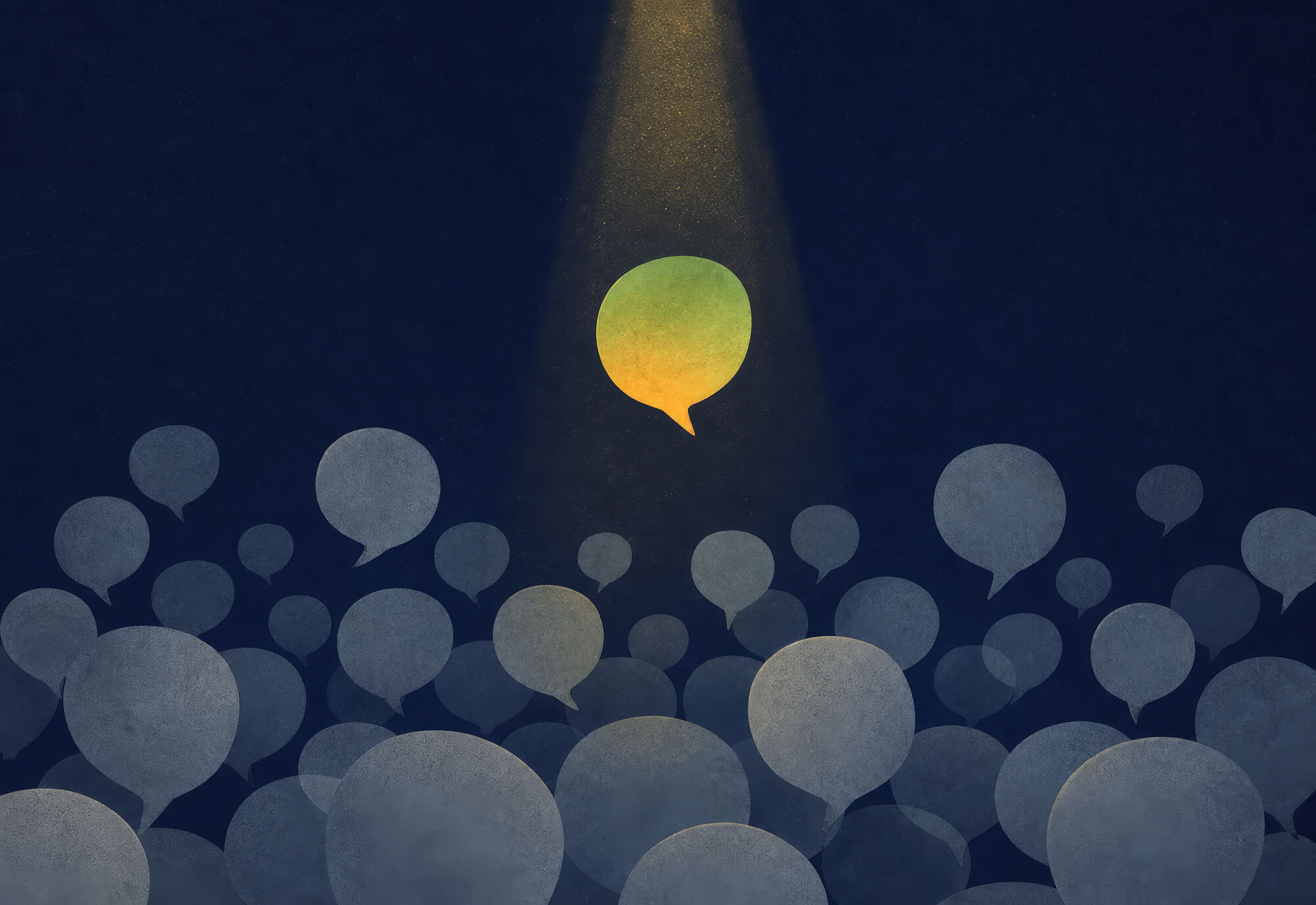
- Contrast directs attention: Strong contrast draws the eye to key elements, while softer contrast creates a more relaxed visual flow.
- Color harmony builds cohesion: Well-balanced palettes feel intentional and inviting, while disjointed combinations can create tension or confusion.
Whether you’re aiming to build excitement or earn trust, your palette plays a central role in shaping user perception. These principles can help you convey the message you’re aiming for more effectively.
Cinematic Techniques for Color Grading in UX
Cinematic color grading offers a powerful model for UX. For example, a film might shift from desaturated gray to glowing gold to mark a character’s transformation, thus communicating the message on a subconscious level. UX design can apply similar shifts across onboarding flows, checkout screens, or support pages.
For example, in one recent Matcha Design project, we utilized the “hero” section to establish the emotional foundation for user interactions with a local mortgage company. We employed a muted blue background paired with soft, off-white overlays to convey trust and professionalism. Subtle accents were added to humanize the interface and lend a welcoming tone.
The exact palette and choice will differ from project to project, shaped by each client’s goals and brand identity. However, the underlying approach of cinematic coloring proves helpful in a wide variety of contexts.
Tools and Workflows for Implementing Your Color Palette
Color grading your interface doesn’t require cinematic tools. Resources like Adobe Color enable you to explore a variety of mood-based palettes, while Coolors generates flexible schemes you can use across web and app interfaces.
Once your emotional direction is set, the next step is to turn your palette into a system. If you’re managing the color scheme in code, use semantic tokens like –btn-warm-saturated or –bg-muted-calm. This approach keeps your styles organized, readable, and easy to maintain, even if someone else takes over the project later on.
Measuring Emotional Impact
Subtle color choices can shift behavior, but it takes data to understand their full effect. One way to gather this type of information is to survey your users, asking mood-based questions such as, “How did this screen make you feel?”
That said, your most impactful data will come from measuring the behavior of real users “in the wild.” Here are some metrics we recommend tracking with analytics tools like G4A or Hotjar.
- Click-through rate (CTR)
- Bounce rate
- Dwell time
- Conversion rate
- Scroll depth
- Time to first interaction
- Session duration
Building a Consistent Brand Kit
Once you’ve established a clear emotional direction, the next step is to translate it into a brand kit that your entire team can rely on. A well-crafted set of guidelines will ensure your color choices are consistent, whether you’re designing a homepage, a landing page, or a social media graphic.
Start by selecting a core set of brand colors that reflect your values and tone. Then, define how each color should be used. For example, which shade of green signals action? Which background tone conveys calm or clarity? Include usage examples, accessibility guidelines, and notes on when to apply secondary or accent colors.
Of course, a brand kit goes far beyond color. It often includes typefaces, logo variations, icon styles, photo treatments, voice and tone guidelines, and even motion design principles. These elements all contribute to the emotional impression your brand makes. When thoughtfully developed, each component supports the others. The typography reinforces your tone, your visuals reflect the voice, and your colors tie everything together in a way that feels cohesive and intentional.
Let’s Build Your Brand Together
If you’re looking to improve your use of color, build an unforgettable brand, and boost conversions across your website, Matcha Design can help. Get in touch today to learn more about our brand development services!