Recently Matcha president/creative director Chris Lo and I were hashing out a solution to a problem. We needed to create print-quality images for a client, and use those same images on their website, which we were also building.
The problem is that print requires high density images to look good – 300dpi is standard. When displayed on a screen, the DPI property of an image file has no bearing on its physical size. That’s because the DPI used is actually that of the screen. So if we have an image that’s meant to print at 3 inches wide at 300dpi, it’s 900 pixels wide, which is pretty large on most screens.
The easiest solution is to specify the width and height of image tags in the HTML, but there are several reasons why that is a terrible idea. First, the image files would be a very large download. Second, we’re relying on the browser’s rendering engine to scale the images and still look decent, at which some will fail miserably. And third, not all browsers support dynamically scaling images that are used for backgrounds of elements, as it’s a CSS3 feature.
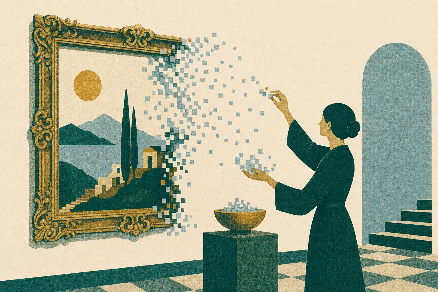
Clearly, the only viable solution is to produce two different sizes of each image. Typically, 72dpi is used for graphics that are meant to be displayed on-screen. But, scaling a 900 pixel image down to 216 pixels produces less than ideal results. Depending on the situation, an unsharp mask, Photoshop’s “Cubic (Sharper)” option, or some other filtering may suffice to make the image look good. In some situations however, we realized that the image was just too distorted.
If you’re dealing with nothing more complicated than vector graphics and gradients, simply scaling your graphics up or down shouldn’t be a problem at all. Vector graphics aren’t restricted to whole-pixel spaces, so if a fraction is produced in scaling, it isn’t a problem. Raster graphics, on the other hand, don’t always scale quite so gracefully.
Because of the way that scaling with pixels works, it’s easiest to resample in powers of two. So for example, resizing from 300dpi to 150, or from 72 to 144. The problem is that we were just barely off – 3dpi – from scaling to one fourth. In this case, we knew what size we wanted the images to be on the website, but the specs for the print images were only approximate. So our solution was to create the high-res images at 4 times the size we needed on the web, (a few of them at 8 times) and resample them to 75dpi. Then, just to be consistent, set the dpi of the images to 72, without resampling. The result was very clear images with the right pixel dimensions for the web, and high-res versions that were plenty big enough for print.
This may not work perfectly for your situation. If you can’t make it work for a power of two, try to do a different whole multiple. Scaling to 1/5 is still better than 24%. If you know both exact sizes that you need, and there’s no obvious relationship to the numbers, try to make the original bigger than both, while also a good scaling size for the smaller one. Scaling by just a little at an odd percentage usually works better than scaling by a lot at an odd percentage, so it should still look good if the print quality version is 97% of the original. Again, you might need to do some trial and error with various filters to get the best result.