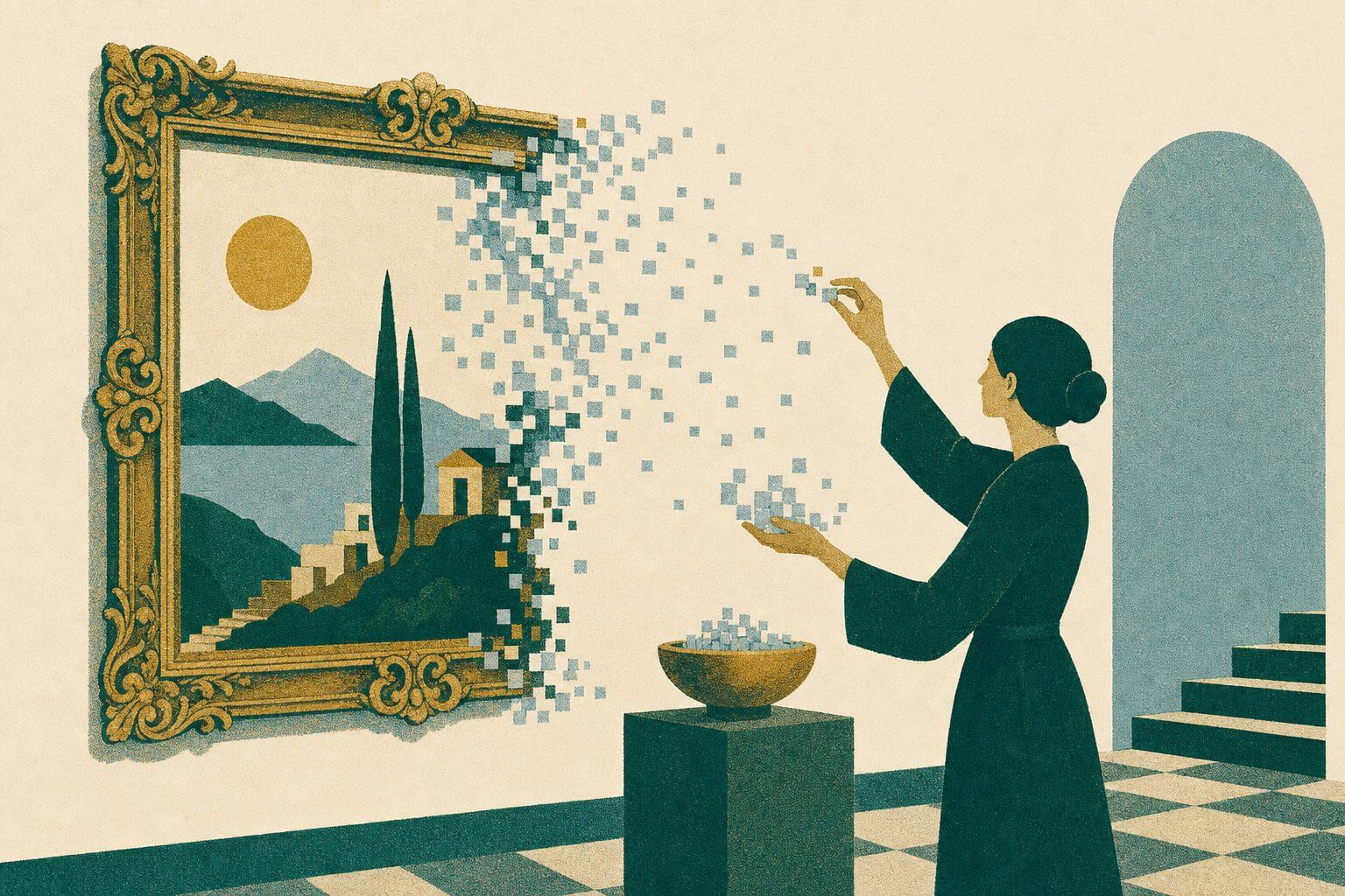
Timeless graphic design is a great goal to strive for, but with many designs, it’s less of a priority. No matter how timeless your Instagram story’s design is, it will be here today and gone tomorrow. With logo design, on the other hand, a timeless design can make the difference between establishing a long-term, recognizable brand and needing to revamp your entire brand kit every few years to stay with the times. Here, we’ll go over a few logos that have stood the test of time, what they have in common, and how you can strive for lasting logo designs.
Case Study 1: Nike’s Swoosh

The Nike Swoosh has become iconic over its 53 years in existence, showing up from sports arenas to music videos. However, Nike’s leadership didn’t always think it would be a resounding success. Nike Co-Founder Phil Knight is on record as saying, “Well, I don’t love it. But it will grow on me” when they finally selected the swoosh out of a series of options from graphic design student Carolyn Davidson. Now, that simple doodle can be seen in every shopping mall and school as people proudly wear their Nikes.
This logo design was meant to capture movement, and did so in the simplest way possible: a single stroke, changing direction partway through. It is plain enough to be recognizable, but unique enough from other shapes on shoes and clothing that it stands out in a lineup of similar shoe models. Its simple color scheme also helps it stay timeless, as the original black-and-white design translates easily as trending hues shift over time.
Case Study 2: Apple’s Apple
While Apple’s Co-Founder Steve Jobs later became known for his high expectations and particular requirements, back in 1977, his only direction to logo designer Rob Janoff was “Don’t make it cute.” He ran with the imagery of apples and created the original with multicolored stripes, because at the time, the Apple computer was the only one that displayed images in color. Since then, it has evolved into the monochromatic shape we see today on the back of every Mac and iPhone.
This logo design’s timelessness stems from its clear connection to the company name. It’s hard to think of anything that would say Apple more clearly than a literal apple! Its simplicity also plays a huge role, as it is straightforward enough for someone to draw from memory.
Case Study 3: Coca-Cola’s Script

Unlike the first two logos we discussed, Coca-Cola’s classic logo is not a simple image. Instead, it began with a base of the brand’s name in simple Spencerian script, which has been modified and added to for various campaigns since its 1886 inception. Most of these changes were temporary for a specific campaign, and outside of adding ™ to the logo, the main lasting change we still see today is the addition of a white “wave” underline from 1969.
This logo has maintained a relatively simple design over the years, but instead of clear and memorable imagery, it uses a distinctive script. The fonts you use in your logo matter, and Coca-Cola’s logo is a great example of that, as its font evokes thoughts of simplicity and smoothness.
Common Threads Among Timeless Logos

There are three main common threads in these logo designs: simplicity, versatility, and memorability.
- Simplicity: These logos are as simple as possible, minimizing any distracting elements that could pull away from the brand’s messaging and making it easy for people to see and understand the logo in a variety of contexts.
- Versatility: Each logo looks just as natural on the company’s products as it does on co-branded items, such as clothing or jewelry, or in advertisements. There’s nothing about the logo that could be lost in translation, such as only being recognizable when it’s backlit or has a metallic sheen.
- Memorability: Whatever your logo’s impact when people see it, the true value happens when they remember it and come back to your brand later on. Whether that’s someone on a road trip recognizing the comforting glow of McDonald’s golden arches or a busy parent in a grocery store spotting Tropicana orange juice, a memorable logo helps keep consumers coming back for more.
Each of these factors helps a logo to stay timeless, even as there are decades of cultural and aesthetic shifts happening around it.
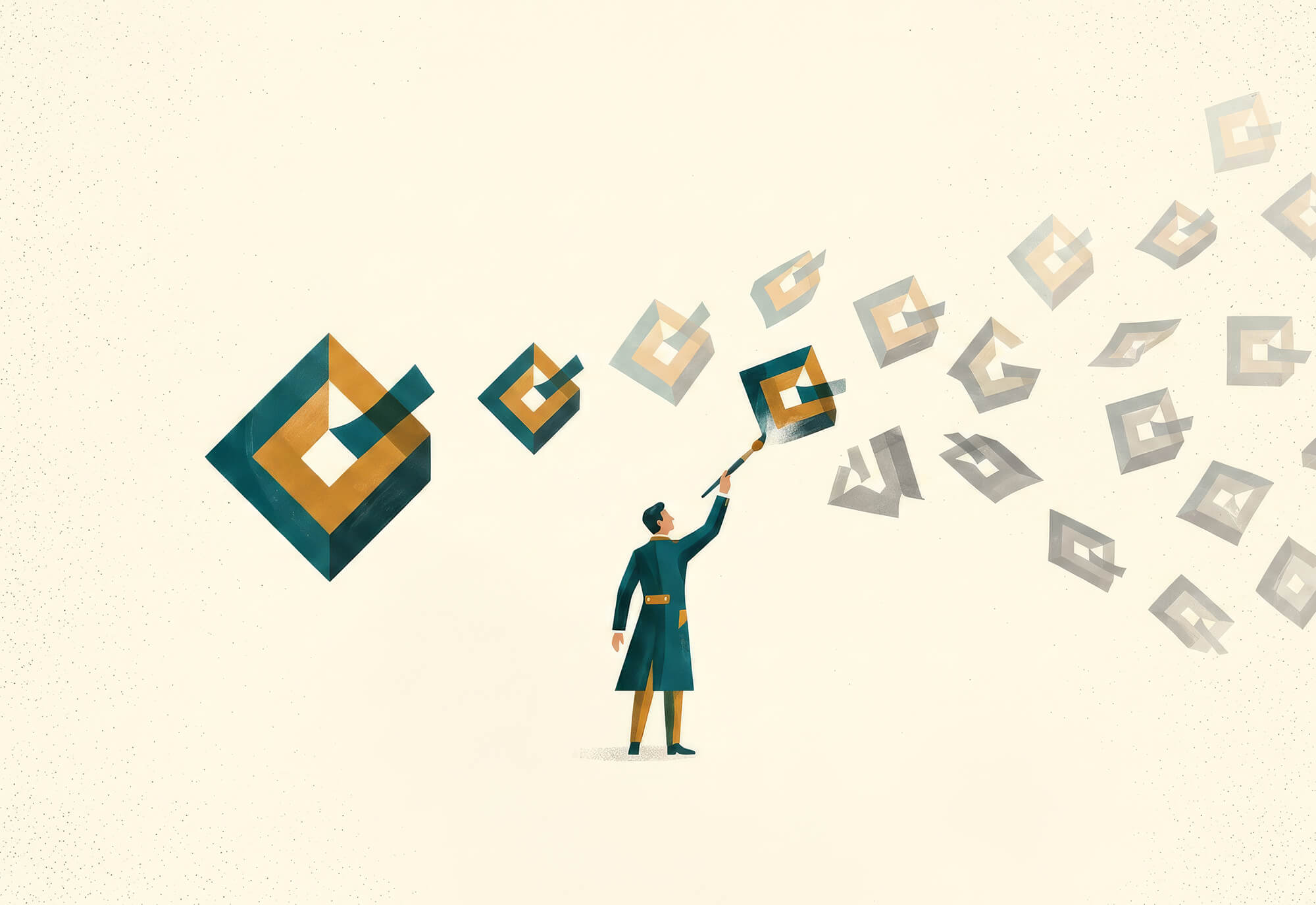
Striving for Longevity in Logo Design
Having to redesign a logo to stay with the times is costly in more ways than one. In addition to the literal cost of having a designer work on your logo, it costs you in consumer recognition, needing to retire old materials branded with a dated logo, and your own time and mental space. When it’s time to design your next logo, work with the Matcha Design team to make sure it is effective and timeless.