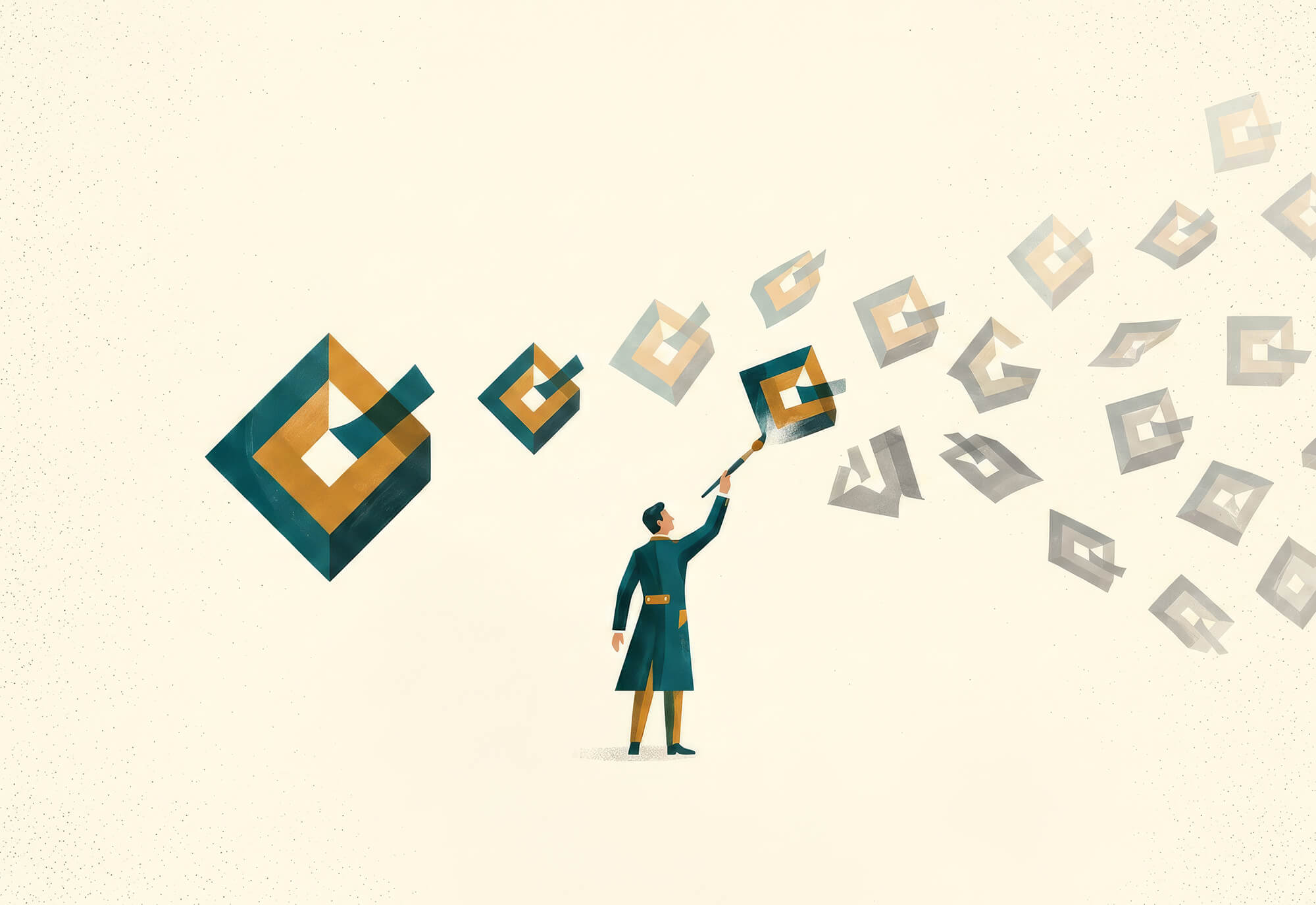
Applying Cognitive Principles for Clarity and Impact
A well-designed site can still underperform. Even with consistent blogging and thoughtful, high-quality content, organic traffic may remain flat. When that happens, it’s rarely because the work lacks value. More often, it’s because the site is missing a few key elements that search engines need.
A well-designed dashboard can help users make sense of complex data at a glance. Get the UX wrong, however, and you’ll leave viewers feeling overwhelmed, confused, or even misled. Organizing information into a beautiful and intuitive user experience is easier said than done, but there are core principles that can guide you towards better results.
The best dashboards are grounded in the way that people think. They incorporate features of both art (like visual clarity and emotional resonance) and science (such as cognitive psychology and UX research). When these elements come together seamlessly, the results can be game-changing.
The Art of Dashboard Design
Beautiful art is more than just unstructured self-expression. Jazz musicians, impressionist painters, and postmodern architects alike all work within frameworks of tradition and technique, even when they choose to bend those rules. Designing digital experiences is similar: you can (and should) be unique, but you should also keep in mind the best practices that other designers have established before you.
Less Is More
Minimalism is a cornerstone of effective digital design. Consider how Google’s clean search bar quickly eclipsed cluttered directory page style competitors like Yahoo, or how Spotify Wrapped has become such a cultural phenomenon. The same logic applies to dashboards: users appreciate and connect with clarity.
Whitespace plays a crucial role in minimalist design. It reduces visual noise, improves glancability, and makes every element feel more intentional. This approach also leaves space for thoughtful brand alignment. With fewer competing colors and elements, a single highlight color from your brand kit can stand out elegantly. Similarly, simplicity gives your logo room to shine.
Unified design patterns, restrained use of color, and repeatable layout structures all contribute to a sense of cohesion. On laptop and phone screens, a simple design leaves room for meaning, while complexity creates confusion.
Hierarchy and Harmony
Have you ever seen a dashboard that appears to be a random, unstructured collection of widgets? This problem occurs when designers fail to express the relationships between the various elements on the screen. To help users process information, your page should convey a clear hierarchy of data. Typography, color, and layout should all work in concert to show users what matters most and what is merely supporting information.
Size and weight can guide the eye toward primary data points while keeping secondary information subtly subdued. Organizing content into a clear grid helps establish spatial relationships between elements so users don’t have to guess about what goes together. Related items should be grouped to help people understand the big picture at a glance.
Harmony is achieved when everything feels like it belongs. When the layout, spacing, and palette work together, users start to notice the insights more than the dashboard itself.
Storytelling through Data
Data without structure is just noise. The best dashboards guide users through a narrative, making complex metrics understandable and actionable.
A well-structured news article typically begins with an overview of the situation and naturally transitions into more detailed perspectives. Similarly, dashboard users should first see high-level trends and summaries, then be able to explore deeper layers as needed. This drill-down approach mimics how people think: general first, details later.
Visual flow matters too: placing related elements close to each other and aligning charts and labels thoughtfully helps create intuitive pathways. Subtle visual cues can enhance this effect: annotations, microcopy, and icons offer clarity without adding clutter. These small touches help users interpret what they’re seeing, like punctuation marks in the dashboard’s story.
Delightful Details
The famous industrial designer Charles Eames once said, “The details are not the details. They make the design.” This concept applies just as well to the art of dashboard UX as it does to furniture and architecture. Subtle touches, such as hover effects, animated loading states, or interactive chart transitions, can make a significant difference in how users perceive the product.
This matters because when users enjoy a dashboard, they’re more likely to return to it regularly. Some other popular strategies for adding flair and creating a sense of emotional connection and responsiveness include:
- Animations that reveal filtered results in real time
- Gentle pulses to indicate live data updates
- User tips that appear exactly when needed
- Celebration icons when users hit goals
All that said, restraint is key. Microinteractions should support clarity and reinforce what’s happening on the screen, but they can quickly become a distraction if taken too far. When done correctly, they add a graceful human touch that enhances engagement and encourages repeat use.
The Science of Dashboard Design
Aesthetics alone won’t help users make informed decisions or discover valuable insights. The best dashboards are often built on a foundation of behavioral science. Great dashboard design matches the way the human brain actually perceives, remembers, and processes information.
Cognitive Load
The human brain is an incredible machine, but it can only hold so much information at once. Working memory is limited: the average person can only process 5 to 9 items at a time, according to Miller’s Law. Add too many elements to a dashboard and users will start to struggle, especially when decisions need to be made quickly.
To reduce cognitive load, organize items under categories like “sales overview” or “traffic sources.” Progressive disclosure is another key strategy to help users keep ideas organized; this refers to showing high-level metrics first and then revealing more details as the user seeks them out. This layered approach mirrors how people naturally seek information.
Selective Attention & Tunnel Vision
Jakob Nielsen’s research on selective attention shows that just because information is visible doesn’t always mean it’s seen. Users focus on what they think is relevant to their immediate goals at the expense of everything else. This narrowing of view, often referred to as tunnel vision, is a natural byproduct of trying to filter out noise.
Eye-tracking studies reveal that most users scan screens in an F-pattern, focusing on the top-left portion of the screen. Even within that focus zone, visible content can be missed if it isn’t emphasized. This issue isn’t visibility, per se, it’s a lack of visual weight of perceived relevance.
To combat tunnel vision, your layout must align with user goals. KPIs and urgent alerts should be placed in the top-left corner, where attention naturally tends to focus. Contrast, whitespace, and clear labeling can further elevate what matters most, ensuring that vital metrics are seen, understood, and utilized.
Anchoring Bias
First impressions shape how we interpret data. Anchoring bias refers to our tendency to rely heavily on the first piece of information we see, even if it’s arbitrary. In dashboard UX, that “anchor” is often the first KPI or headline chart that users encounter.
A common example of this phenomenon in action occurs when the metric at the top left is monthly revenue, which resets to zero on the 1st of each month. Users might log in early in the month and immediately see an alarmingly low metric. This could shape the way they interpret other data, even numbers that offer a more balanced view over a longer timeframe. Conversely, seeing a positive metric upon entering the dashboard could cause users to interpret subsequent data (like cost per acquisition or churn) in a more positive light.
Designers should use this to their advantage by being intentional about what appears first. Lead with stable, high-level indicators that provide an accurate and honest sense of overall performance. Don’t bury the lede. (Or worse, accidentally create one by putting an alarming but minor metric up top.) Anchoring can subtly influence decisions, so make sure the anchor is accurate, relevant, and fair.
Graphical Perception
Not all charts are equal when it comes to human interpretation. Cleveland & McGill demonstrated that we’re far better at reading values in bar charts and line charts than in pie charts. In practice, dashboards should rely on bar and line visuals for core metrics, reserving sparklines and heatmaps for small glanceable cues. When visuals require effort to decode, they can slow users down or even cause misinterpretations.
Gestalt Principles
Long before the advent of modern UX design, psychologists in Germany developed the Gestalt principles to explain how humans instinctively perceive structure and patterns. We don’t just see individual elements: we see unified wholes. These studies have had a profound impact on digital design. In dashboards, designers use Gestalt principles to help users instantly grasp relationships, prioritize information, and make sense of complex layouts.
- Elements that are close together are perceived as related. Grouping similar metrics, like revenue, orders, and AOV within a single card can help users understand them as part of a unified story.
- When charts, icons, or numbers share a color or style, users automatically associate them. This supports scanability and minimizes the need for explanations. For instance, using one color for all conversion-related metrics reinforces their shared purpose.
- The human eye prefers to follow paths and lines. Aligning graphs and tables along a clear visual flow guides attention and reduces friction.
- Even when parts of a shape are missing, users will mentally fill in the gaps. Designers can use this to suggest boundaries or groupings without drawing full boxes or borders, reducing clutter while maintaining clarity.
- Figure-Ground: This principle helps users distinguish between foreground (critical data) and background (supporting visuals). Strong contrast, generous padding, and intentional whitespace help users lock in on the insights that matter.
Design with Purpose
Crafting a powerful dashboard is both an artistic endeavor and a scientific discipline. By combining an aesthetic vision with cognitive psychology, you can create a user experience that enables people to make more informed decisions.
Need help creating the perfect dashboard experience for yourself or your clients? Matcha Design offers the expertise, creativity, and vision that will bring your ideas to life. Get in touch today to begin building your dashboard together!