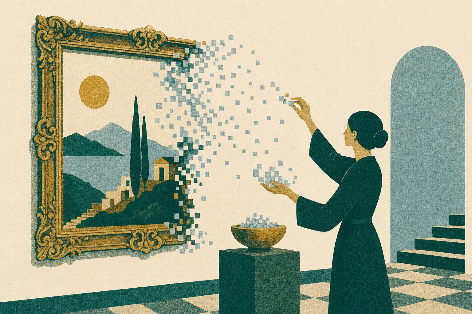
Everything you do has an impact, whether it’s your marketing strategy or the user experience (UX). The goal of UX design is to make it as easy as possible for your website or app users to navigate and interact with the design – so what are some of the things that could be standing between you and the best UX possible?
You’re Giving the User Too Many Options (Cause)
“Where do you want to eat?” is sometimes a loaded question. The sheer number of options becomes overwhelming, and it’s hard to know what type of cuisine to eat, much less which restaurant to go to!
It’s easy to get overwhelmed when given too many choices. While Eastern countries favor having everything at their fingertips, that’s not the case in most Western countries. We tend to prefer a clean, simple, easy-to-navigate layout.
They Take Longer to Make a Decision (Effect)
In the same way that having too many options can make you take forever to pick a restaurant, giving site visitors and app users too many choices can have a negative impact on their decision-making time. They might feel they need to go over each option individually, weighing out the pros and cons.
Of course, weighing the pros and cons of each option increases exponentially based on how many options you give them – and a higher chance they’ll get frustrated with the process and give up halfway through. This is the basis of Hick’s Law: “The time it takes to make a decision increases with the number and complexity of choices.
For better UX, offer 2-3 fantastic, well-suited options rather than a long list of options that probably aren’t a good fit.
You Expect People to Remember Too Much (Cause)
Memory games often include long lists of items, with the goal being to remember as many items from the list as possible. No matter how confident you are that you’ll be able to remember them all, chances are that you’ll forget most of them by the time you need to recall the information – unless you use specific memory devices to improve your memory.
The thing is – the average person isn’t actively trying to memorize things. Another law that applies to user interface (UI) design is Miller’s Law: “The average person can only keep about seven items in their working memory.”
They Become Frustrated with the Process (Effect)
Think of memory as a juggling act. Seven items are probably too many for successful UX, considering an average is taken from the highest and lowest numbers. In the same way that you should keep the number of options limited to 2-3, it’d be best not to expect the app user or website visitor to remember more than five things at once.
If you can get it down to a lower number, that’s even better.
Your Design Doesn’t Stand Out (Cause)
Remember “Where’s Waldo?” Some kids spent hours poring over the pages of those books, looking in earnest for Waldo. Why was it so hard to find the guy? Because there were so many people who looked like him! Everyone was dressed in a red and white striped shirt or had glasses on or a red and white knit cap. Most of them were a combination of the three!
If you’re a skilled professional, chances are you’ve done the research and want to be successful like your industry competitors. You might think, “Oh, this is working for them – I’ll try it!” The thing is that when you copy someone else’s processes, designs, or copy, you’re sabotaging yourself by blending into the crowd.
Leads Are Going Elsewhere for Your Service (Effect)
You know better than anyone what you’re up against in terms of competition. Chances are, your competitors have similar offerings, services, and capabilities, so what can you do to stand out if you’re losing leads to competitors? Change your design. If everyone in your industry uses blue colors, do something different. Choose green, orange, and yellow!
You can also stand out in your content. If everyone in your industry speaks formally, make it a point to talk in a down-to-earth, approachable way. By being different, “your people” can quickly find you like a lifeboat in a sea of sameness. This is the Von Restorff Effect/Isolation Effect.
Your Layout is Too Unique (Cause)
“Wait – you just said we needed to stand out!” Yes, that’s true – in all cases but layout. Imagine entering a room, but what appears to be a window is actually a door, and vice versa. You’d have to completely re-learn how that room works and remember the room is oddly different from any other room you’ve ever entered any time you went back into it.
It would get frustrating pretty quickly, wouldn’t it?
Users spend most of their time on other sites – so they prefer sites that work in a similar way to what they’re already used to. This is known as Jakob’s Law.
Users Don’t Know Where to Find Info (Effect)
When something looks like a CTA button, but it isn’t, that’s incredibly frustrating. The person who was excited to book a call or learn more is now turned off because they have to go digging for information that should be readily available.
While it’s OK in some cases to take creative liberties here (“Resources” or “Articles” vs. “Blog”), it’s best to keep them few and far between. Clarity is the best way to go!
Your Buttons Are Small or Scattered (Cause)
Speaking of CTAs, how big are your buttons, and where are they placed? Marketing is all about strategy – that’s why indoor mapping is a big part of merchandising for grocery stores. (They keep that candy at the checkout, so you have to stare at it the whole time, thinking, “I do deserve a treat, I just bought all the groceries for my household!”)
Having small, scattered CTA buttons is like hiding pasta in the pet food section or putting juice boxes in the liquor aisle. You can’t find what you’re looking for, and if you do, it makes no sense!
It’s Tough to Navigate the User Journey (Effect)
Fitts’ Law says: “The time to acquire a target is a function of the distance to and size of the target.” Navigation should be simple and straightforward. For example, a site visitor on your blog page should find the “Next” button in the same place every time. It shouldn’t jump around while they’re quickly trying to find a specific blog post.
You can get clever with this, too. Your CTAs should be large enough to be clicked on any screen (desktop, tablet, or mobile phone) and follow the user journey you want them to take. Some people exploit Fitts’ law by making it difficult to click away from their website or ad (have you ever noticed how tiny the red “x” is sometimes?).
Follow Matcha Design for More UX Tips
Although you can use these superpowers to become a dark lord, we hope you use them for good! Want to know more about UX/UI design, marketing, and more? We’re happy to help – check out our blog for tips or sign up for our newsletter at the bottom of our “Contact” page!