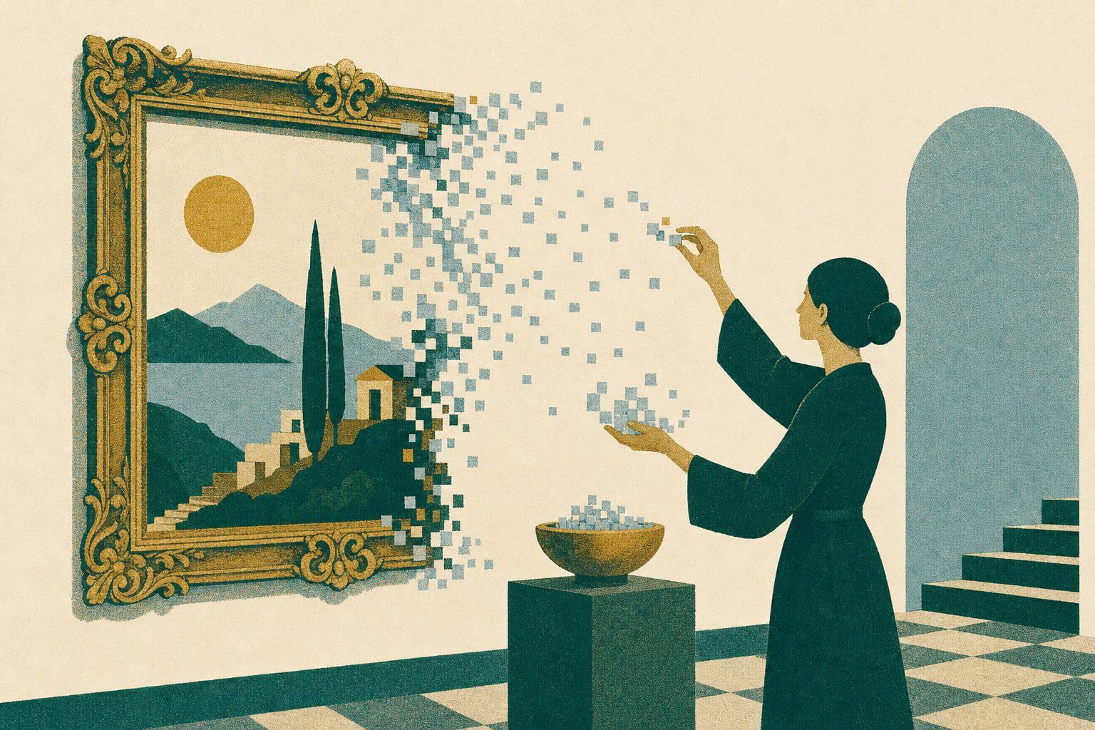
Whether the project is graphic, animation, video, architectural, or product design, fully understanding both space and scale is crucial. At the fundamental level, this is built upon spatial savvy — the effective use of whitespace, grouping, visual elements, or otherwise arranging your design within your canvas area to achieve a desired emotional response from the viewer.
The relationship between the different elements in a design can foster tremendous impact and create a consistent response from viewers. By combining scale, the placement of color, and good spatial awareness, you can tell a story in a multitude of ways.
Space and scale in a design can be used strategically with graphical elements, typography, chosen imagery, and even whitespace. That said, we make plenty of common mistakes that can lead to inconsistent results or poor visual storytelling.
Common Mistakes
Confusion
When a design isn’t prioritizing the elements within a piece, it can cause the audience to question what is important, what they’re supposed to look at first, or why they’re even looking at it in the first place. This can hit the real world in something as straightforward as billboard design, making it difficult for drivers passing by to clearly make out the company name and headline.
Not Believing That Less Is More
We’ve all come across direct mail and brochures that are totally jam-packed with information — small fonts, hard-to-make-out leads, and no whitespace to be seen. This bombardment of the senses usually invokes a quick toss into the trash pile. Of course, clients will always have information that needs to be placed into a fixed space due to media costs, industry limitations, or even government regulation (think of fine print). As designers, it’s our job to solve that problem in the most creative and effective way possible.
Lack of Spatial Awareness in the Environment
This next point concerns the medium in which your audience will be seeing and visually navigating your work. Keep in mind how people will be presented with your design, or it can fall prey to a range of usability issues. At exhibitions or trade shows, you’ll often find background banners with so many bullet points that people simply bypass the booth. And on mobile devices, buttons or text links might be so close to one another that users struggle to read and click accurately.
Just Place It Where you Like It
Lastly, designers can run into trouble when they place elements within a design for the simple reason that they like it that way. Instinct and natural ability are one thing, but it’s poor practice to act on any part of your design without thoroughly analyzing the underlying strategy behind the proper use of space and scale. You should always ask yourself why your viewers might feel disoriented or what kind of message you are trying to convey.
Solutions
In each of the above cases, learning to use space and scale effectively is paramount to working through a solution. By compartmentalizing different elements of your design’s content on the page, you can set correct priorities and establish a natural flow. Here are some tips to guide you through the process.
Audience Engagement
Keep the level of engagement in mind. If you have only five seconds to get your point across, focus on expressing the most important message. As you get closer to a minute or two, subheadings can break up your message into smaller chunks that are easier to consume.
Your audience should be determined to read more of your message because it’s intriguing. Longer pieces should include images to retain attention and interest, and always remember to present a way for your audience to contact you.
Optical Illusions
True for both 2D and 3D spaces, when your spatial constraints are fixed, you can create optical illusions to help your design hit home. Remember that light colors make rooms look bigger and brighter and that dark backgrounds with white or bright text can draw viewers’ attention, particularly when centered as a medium-sized font.
If your viewing environment is a dimly-lit theatre or presentation booth, animated playback designs should avoid lighter background with dark text, as they would tend to blind or repel viewers.
Naturally, understanding these effects and how they elitist audience responses within your viewing environment can help you use optical illusions to your advantage.
Position and Scale with Care
There’s a reason why fine print is always at the bottom of your screen, small in size, and without high degrees of contrast. Sign-off elements are always better positioned within the footer of a piece.
Regardless of where you position certain design elements they need to establish meaningful relationships with one another. So take the time to step back and look at the whole picture, examining it each time you complete a layout. This is where asking for a second opinion is exponentially useful.
If you haven’t had the opportunity yet, you might also consider taking a psychology course. Without understanding people’s social reactions to stimuli, you can’t fully utilize all of your design experience.
Maintain the healthy mindset of learning from award-winning designers; deconstruct and analyze how they solved design problems, then try those strategies with your own work. It’s easy to copy someone else’s idea or design treatment, but without understanding the principles behind the design, you’ll never improve upon your own skills.
Stay tuned for our next installment on design, Typography.