Consolidated Partner
Growing Newsletter Engagement for an Enterprise Software Company
“Reader engagement with newsletters seems easy, but it is actually challenging to maintain interest while conveying all the information you need. However, Matcha’s design team made the task effortless for us, adding to our partner’s knowledge and reader experience.”

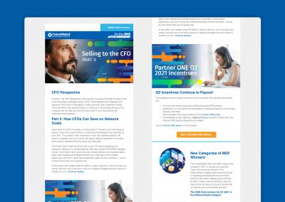
Facilitating an Eye-Popping Newsletter that Interacts with Pardot
For this project, our creative team had to navigate a very worthwhile yet complex software called Pardot. This Salesforce Customer Relationship Management (CRM) program automates Business-to-Business (B2B) lead generation for its users by funneling and tracking potential customers via automated marketing campaigns, then analyzes activity and engagement. Our team knows from experience that interacting technically with this software is just as intricate as it is with its CRM.
Our team used its expertise to create a standardized strategy for the newsletter, positively impacting reader engagement with content, integrating our product with Pardot, and testing all aspects of our product for current and future challenges the client, Consolidated Communications, could experience. What resulted was a very appealing and informative newsletter that maintained its integrity and engagement no matter how Partner ONE used it in Pardot.
“The integration with Pardot made us nervous, but we had the right people for the job. Matcha Design handled it all and gave us a fantastic product.”


Challenge
In addition to the newsletter, our team faced compatibility obstacles associated with our client’s chosen platform, Salesforce’s Pardot. We needed a responsive newsletter that audiences could engage with without Partner ONE experiencing the hiccups SalesForce’s Pardot resulting from our newsletter. Some of the most predominant challenges with Pardot are syncing and automation of information from any lead generation, and user activity tracking by completion actions.
Solution
With Pardot, we had the luxury of previously making Partner One’s branding, so we were very familiar with structuring our products to maintain integrity and integration. We hard-coded our products and imported them onto Pardot. Once on Pardot, we tested links and proofed everything. Our team decided that a custom text-only version gave us a cleaner and neater product than using the auto feature through Pardot.
Everything we did so far we knew would ensure our success for the client. However, our team wanted to test different aspects to ensure the reliability of our work. The team used Rendering Tests by Litmus to test the various email clients and see the impacts, if any, on delivery and eye appeal on different types of devices. Since Pardot offers a vast amount of tracking features, we needed to know that our products can withstand whichever avenue the client wants to use them. Therefore, we sent out many types of individual test emails to stack holders for review before their scheduled blast, and the reward was many successful deliveries.
With everything locked in, our project was ready to move forward. However, similar to web design, email marketing design constantly needs improving, so our team reviewed our product adding slight upgrade to the newsletter appearance, simplifying it even further and tightening up the visuals. We are constantly offering solutions and consistent service to our clients, overcoming any current and future challenges.