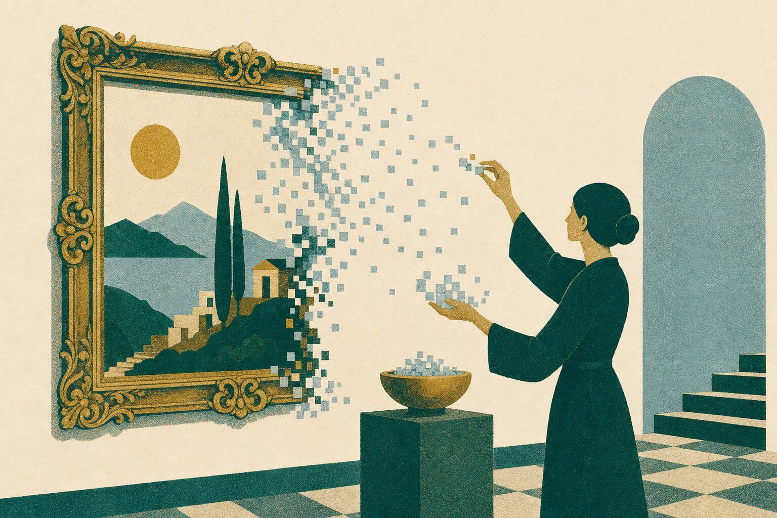
There are some rules and tricks of logo design that trained graphic artists learn through education and experience. At the very least, you should know some basics about brand identity theory before you create your new brand icon.
Following are 7 Killer Tips For Logo Design that can get you on the right creative path:
1. Stick to one or two colors and never use more than three colors.
A logo that uses a variety of colors can get cluttered and overwhelming. Also, it’s more expensive to produce multi-color logos in print. Use only one or two fonts. Too many fonts leads to a logo that looks like a bunch of unrelated pieces put together rather than a cohesive unit.
3. Make sure it works in black and white.
If your logo works in black and white, you can be confident that it’s a good design, and make sure it works on both light and dark backgrounds. Don’t forget the backgrounds that your logo will appear on. Test it on both light and dark backgrounds to make sure it’s legible and that it looks good in all sizes.
3. Don’t use photos.
Photos don’t reproduce well in many media, and they can make a logo seem outdated too soon. It’s never a good idea to use a photo in a logo design.
4. Your logo will appear in many sizes throughout your brand’s lifecycle.
Test it at business card size and billboard size to make sure it’s scalable. Stick to a two-dimensional design. Three-dimensional logo design is very popular, but for beginners, two-dimensional icons are a safer choice.
5. Analyze the negative space in your design.
Don’t forget to look at the negative space in your design, too. That’s the empty space in and around the elements of your logo. For example, the FedEx logo includes a right-pointing arrow in the white space between the “E” and “x” in its logo. You don’t want anything undesirable to appear in the negative space of your design that doesn’t match your brand promise, so be sure to check it.
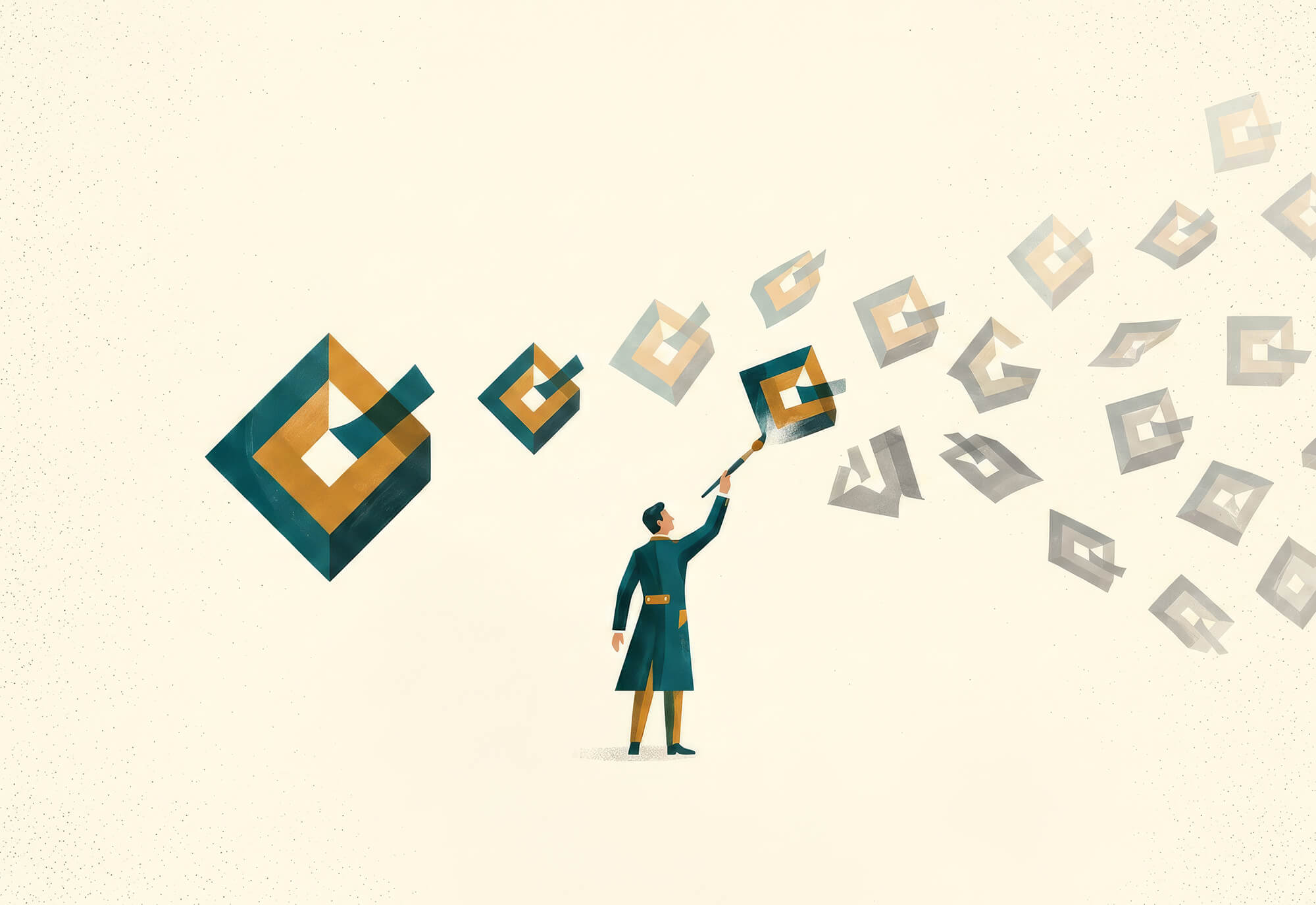
6. Create a vector logo.
Make sure the logo you create is in vector format so it can be resized and used in a variety of media without losing any quality.
7. Don’t use gradient, shadow, bevel, or emboss techniques. (If you do, make sure you’ve an alternative version.)
Many creative techniques look pretty, but they’re challenging to reproduce in varied media. For example, a gradient design cannot be reproduced effectively in the hot stamp printing process used to produce many premium items like mugs and pens. Similarly, it’s very difficult and costly to embroider a gradient on a shirt or hat.
So, these were the most significant tips to develop your logo towards perfection in all means. I think it will remove all confusion and misperception behind logo designing. However, there are always exceptions to the rules in design for experts who are well educated about such things. If you are looking for an award-winning logo design expert to brand your company’s image, contact us at info@matchadesign.com.