Humans hate waiting. And studies have shown that we especially hate passive waiting. Designers across industries have responded to this in various ways. Naturally, the best solution is to reduce wait time as much as possible. When it comes to web design, for instance, every additional second a landing page takes to load increases the risk that a visitor will bounce.
But when a wait is unavoidable, keeping your audience informed and engaged can make all the difference. That’s why elevator lobbies often display which floor each elevator is currently on. One particularly clever example comes from a Houston-area airport, where the baggage claim was moved farther from the gates. While the time to retrieve bags stayed the same, the time spent waiting shrank dramatically, because most of that time was now spent walking.
In digital design, the go-to strategy for moments of unavoidable delay is the loading animation. But not all loading animations are created equal. Let’s explore how well-designed microanimations can subtly reassure your users and enhance real-world UX.
The Role of Microanimations in UX
The psychology behind microanimations is intuitive. Consider the difference between these two scenarios:
Without Animations: You’ve been staring at a blank screen for what feels like forever. There’s no indication of progress. You assume something’s broken. You leave.
With Animations: You’ve been waiting just as long, but you’re watching a progress bar steadily climb toward 100%. It’s slow, but you can see it’s almost done. So you stick around.
That little bit of feedback makes a huge difference. Not only does it confirm that the app is still working, but it gives you a sense of control and clarity. You’re also more likely to wait it out once you’ve “invested” a few seconds already. It’s a classic sunk-cost fallacy, but in this case, it works to the user’s advantage, providing a better experience.
Common Types of Microanimations
There are many ways to show users that progress is being made, even when there’s a delay. Some of the most common loading animation types include:
Spinners: Circular loaders are simple, abstract visuals that indicate something is happening in the background. They’re a standard default, but can feel vague without additional feedback.
Skeleton Screens: These placeholders mimic the layout of the final content while it loads, offering a preview that feels faster and more purposeful than a blank screen or spinner.
Progress Bars: Linear indicators that fill over time. They provide users with a clear indication of how much longer they need to wait, which reduces uncertainty and the risk of bounce.
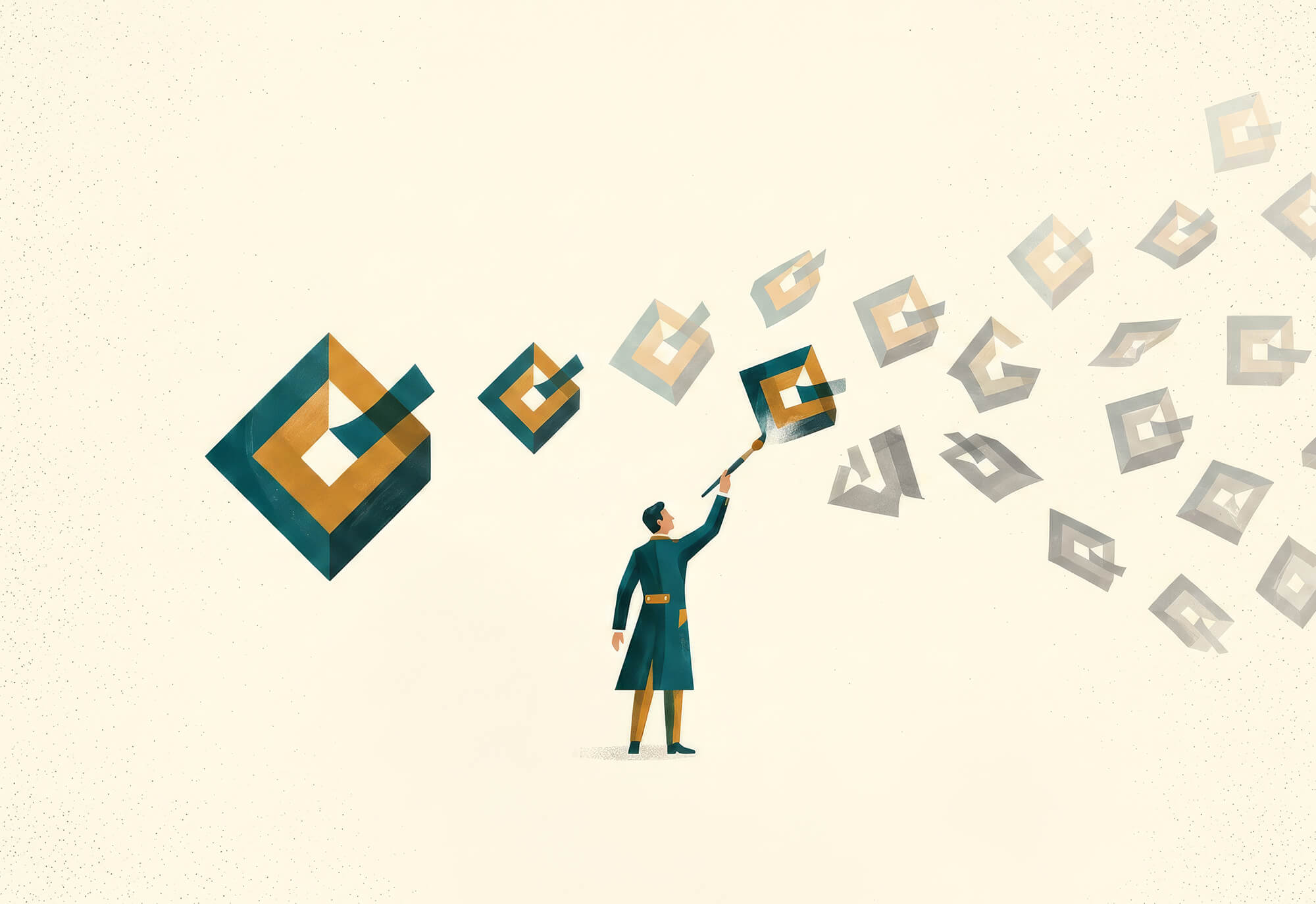
Looping or Animated Illustrations. Brand-specific visuals that repeat or evolve subtly during load times. These add personality and delight while keeping users engaged.
Keep in mind: your animation doesn’t have to map perfectly to actual progress. The goal is to match the animation speed to the average load time, allowing for flexibility. If things load early, the animation can jump ahead. If there’s a delay, it can linger near the end. Users rarely notice minor mismatches, but they do notice total silence or visual inconsistency.
Design Dos and Don’ts for Loading Animations
A great loading animation does more than just pass the time: it communicates progress, reinforces brand personality, and reduces frustration. Here’s how to get it right:
DO Follow the Loading Animation Best Practices
- Match tone and aesthetics to your brand. A slick, modern fintech app might use a minimal loading bar. A kids’ game might use playful animated characters. Let your visuals reflect your identity.
- Set user expectations. If a process will take more than a couple of seconds, show a progress bar or message to help users understand what’s happening and how long it’ll take.
- Keep it lightweight. Your animation shouldn’t increase the load time it’s trying to mask! Use simple CSS or vector-based solutions whenever possible.
- Add delight where appropriate. Small, charming details such as a wink from a mascot or a witty loading message can enhance the experience without overstaying their welcome.
DON’T Make These Common UX Mistakes in Loading Animations
- Leaving users staring at a blank screen. No feedback at all is the worst-case scenario. Even a subtle spinner is better than nothing.
- Faking speed. If your animation claims something will load in five seconds but it takes twenty, trust erodes quickly. Be honest. (Or at least ambiguous!)
- Looping indefinitely without variation. Repetitive, unchanging animations can feel endless. Add a slight progression or variation to suggest movement toward completion.
- Using heavy, jittery, or overly complex visuals. Laggy or CPU-intensive animations can worsen the problem they’re trying to solve. Keep things smooth and simple.
Measuring the Impact of Your Animations
How do you know if your loading animation is doing its job? Here are a few metrics that can help you assess its effectiveness:
Bounce Rate: If users leave the page before it finishes loading, that’s a sign your animation isn’t reassuring them, or the delay is too long to begin with.
Session Length: If users stick around longer and view more content after you implement microanimations, it’s a positive signal that your user experience has improved.
Conversion Rate: Ultimately, fewer drop-offs and smoother flows can lead to increased sign-ups, purchases, or other key conversions.
A/B testing is the best way to evaluate real-world results. Run two versions of your experience: one with the new animation and one without. Then, compare outcomes across these metrics. Tools like Hotjar make it relatively simple to set up tests and track results without disrupting your workflow.
Want Help Developing a World-Class UX?
Matcha Design can help. We’ve designed animations for a wide variety of contexts: from simple loading screens to 360 videos during Phoenix Suns games. We’d love to collaborate with you next, so don’t hesitate to get in touch!