Oklahoma Chiller
Trade Show Booth Design for an Oklahoma Air Conditioning Repair Service
“When designing graphics for a trade show, we try to create something that looks good from far away while also providing branded marketing information to the design so it looks interesting when a potential client walks closer.”
Type of Work: Trade Show
Sector: Industrials

HVAC Company Commissions Graphic Design for Trade Show Booth
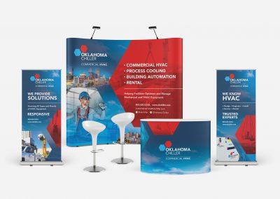
In 2021, Oklahoma Chiller, an HVAC company based in Tulsa, reached out to Matcha Design for help with their trade show booth design. They wanted to create a design that would be useful in an exhibition setting and that showcased their unique branding and capabilities. We always enjoy a project where we have the chance to work on a large-scale immersive design that will completely engulf the audience. We took this opportunity to create a design that was bright and attractive while showcasing the story of the company.
“In a trade show setting, companies only have a few minutes to grab clients’ attention and tell their stories. With our sharp typography and bright colors, we created a design that nobody could ignore.”


Challenge
Oklahoma Chiller wanted to show their clients a few things in their booth design. They wanted to show that they had locations in both Tulsa and Oklahoma City, they wanted to emphasize that they are a commercial HVAC company, and they wanted to tell potential customers about their values as a company. These are a lot of ideas, and we did not want to create an overly-busy design for our client. We also wanted to make sure the design felt friendly and inviting to potential customers, while still maintaining a professional look.
Solution
We began by choosing our colors. Oklahoma Chiller has a bright and popping red and blue color palette that emphasizes that the company works both with heating and air conditioning systems. We kept that color palette and made sure that the photos we inserted into the design fell within that color palette or provided a nice contrast. For example, we chose a few images that have little yellow accents, to jazz up the poster and draw viewer attention toward those accents. Then we began to think about the images we wanted to include. We knew that we wanted to express that there are Oklahoma Chiller locations in both Tulsa and Oklahoma City, so we decided to incorporate the skylines of those two cities into the design. In terms of typography, we decided to use white typography to stand out against the colorful background. Overall the impact of the design was striking.
Awards